This is a heading 1 - var(--h1) - not used any where other than in page banners. Line height: var(--h1-lh)
This is a heading 2 - var(--h2) - only use it for section headings to subdivide the page content. Line height: var(--h2-lh)
This is a heading 3 - var(--h3) - used to subdivide a section that has a heading 2 and for card headings. Line height: var(--h3-lh)
This is a heading 4 - not used
This is a heading 5 - not used
This is a heading 6 - not used
This is paragraph text 2XL - var(--text-2xl). Line height: var(--text-2xl-lh)
This is paragraph text XL - var(--text-xl). Line height: var(--text-2xl-lh)
This is paragraph text L - var(--text-l). Line height: var(--text-l-lh)
This is paragraph text M the base height - var(--text-m). Line height: var(--text-m-lh)
This is paragraph text S - var(--text-s). Line height: var(--text-s-lh)
This is paragraph text XS - var(--text-xs). Line height: var(--text-xs-lh)
This is paragraph text 2XS - var(--text-2xs). Line height: var(--text-2xs-lh)
Spacing sizes
var(--space-2xl)
var(--space-xl)
var(--space-l)
var(--space-m)
var(--space-s)
var(--space-xs)
var(--space-2xs)
Box shadows
var(--box-shadow-dark)
var(--box-shadow-medium)
var(--box-shadow-light)
Text link style
If the link is external, an external link indiocator is autoamtically added.
Button components
A text link styled to look like a button. If the link is to an external website page, choose one of the external-link-indicator classes.
Colours
Colour palettes are:
- Default – Bricks own colours – not used.
- Black to white – pure black to pure white with neutral greys in-between and a range of black transparencies. Used for overlays and text colours and white for backgrounds.
- Action – used to identify clickable links and buttons and also keyboard focus.
- Primary – main colours used for section, container and block background colours and their child text colours. Used to break up the white page background providing some contrast.
- Accent – dark/light pairs used to inject occasional colour onto the page in backgrounds.
To ensure compliance with WCAG AAA for accessibility contrast, ultra-light text/background must go with dark/ultra-dark background/text and light text/background with ultra-dark background/text. Background classes for sections and text blocks have been created (bg-*) that also set any heading and text in the section/block to the appropriate palette contrating opposite as shown below.
Primary palette
primary-ultra-light
primary-light
primary-dark
primary-ultra-dark
Contrasting/dark selections
primary-dark
primary-ultra-dark
primary-ultra-light
primary-light
Accent palette
accent-ultra-light
accent-light
accent-dark
accent-ultra-dark
Contrasting/dark selections
accent-dark
accent-ultra-dark
accent-ultra-light
accent-light
Transparencies
Black with transparency applied in 10% steps starting with 100% transparency.
100% transparent
--black-trans-100
90%
--black-trans-90
80%
--black-trans-80
70%
--black-trans-70
60%
--black-trans-60
50%
--black-trans-50
40%
--black-trans-40
30%
--black-trans-30
20%
--black-trans-20
Image breakout left
Container based layout where the image breaks out of the container to the left edge of the section. When the cards breaks, the image stretches right across the section.
If you add a background colour to the text block and there is no section background colour, add the gap-none class to the container to remove the default gap and then add a padding-all-* class to the text block to add space around the text. If the section has a background colour, add the same background colour class to the text block (no need to remove the gap on the container).

Image breakout right
Container based layout where the image breaks out of the container to the right edge of the section. When the cards breaks, the image stretches right across the section.
If you add a background colour to the text block and there is no section background colour, add the gap-none class to the container to remove the default gap and then add a padding-all-* class to the text block to add space around the text. If the section has a background colour, add the same background colour class to the text block (no need to remove the gap on the container).
Layout A
Card with equal sized text and image columns. The image can be replaced with something else if required (e.g. more text, list etc.).
If you add a background colour to the text block and there is no section background colour, add the gap-none class to the card to remove the default gap and then add a padding-all-* class to the text block to add space around the text. If the section has a background colour, add the same background colour class to the text block (no need to remove the gap).
If you have a single card and want to put the image first, add the class layout-A–image-first to the card.
When the card collapses for smaller devices, the image column is placed at the top.
If you have a group of cards in a container, put the class layout-A-group on the container to set the card spacing. The class automatically reverses the columns for even cards in the group.
Layout B
Card with a layout of 3:2 text column size to image column size. The image can be replaced with something else if required (e.g. more text, list etc.).
If you add a background colour to the text block and there is no section background colour, add the gap-none class to the card to remove the default gap and then add a padding-all-* class to the text block to add space around the text. If the section has a background colour, add the same background colour class to the text block (no need to remove the gap).
If you have a single card and want to put the image first, add the class layout-B–image-first to the card.
When the card collapses for smaller devices, the image column is placed at the top.
If you have a group of cards in a container, put the class layout-B-group on the container to set the card spacing. The class automatically reverses the columns for even cards in the group.
Layout C
Card with a layout of 2:3 text column size to image column size. The image can be replaced with something else if required (e.g. more text, list etc.).
If you add a background colour to the text block and there is no section background colour, add the gap-none class to the card to remove the default gap and then add a padding-all-* class to the text block to add space around the text. If the section has a background colour, add the same background colour class to the text block (no need to remove the gap).
If you have a single card and want to put the image first, add the class layout-C–image-first to the card.
When the card collapses for smaller devices, the image column is placed at the top.
If you have a group of cards in a container, put the class layout-C-group on the container to set the card spacing. The class automatically reverses the columns for even cards in the group.
Layout D
Card with equal sized text and image columns. The image has padding around it.
The card should have a background colour class added to it.
If you have a single card and want to put the image first, add the class layout-D–image-first to the layout D block.
When the card collapses for smaller devices, the image column is placed at the top.
If you have a group of cards in a container, put the class layout-D-group on the container to set the card spacing. The class automatically reverses the columns for even cards in the group.
Layout E
Card where the text block partially sits over the image.
The card should have a background colour class added to it.
If you have a single card and want to put the image first, add the class layout-E–image-first to the layout E block.
When the card collapses for smaller devices, the image column is placed at the top.
If you have a group of cards in a container, put the class layout-B-group on the container to set the card spacing. The class automatically reverses the columns for even cards in the group.
Layout G
Card with a layout of 1:2 text column size to image column size. The image can be replaced with something else if required (e.g. more text, list etc.).
If you add a background colour to the text block and there is no section background colour, add the gap-none class to the card to remove the default gap and then add a padding-all-* class to the text block to add space around the text. If the section has a background colour, add the same background colour class to the text block (no need to remove the gap).
If you have a single card and want to put the image first, add the class layout-G–image-first to the layout G block.
When the card collapses for smaller devices, the image column is placed at the top.
If you have a group of cards in a container, put the class layout-G-group on the container to set the card spacing. The class automatically reverses the columns for even cards in the group.
Layout H
Card with equal sized text and image columns.
The card is meant to have a background colour class added to it.
If you have a single card and want to put the image first, add the class layout-H–image-first to the layout H block. Card automatically reverses the columns for even cards in a group of cards.
When the card collapses for smaller devices, the image column is placed at the top.
If you have a group of cards in a container, put the class layout-H-group on the container to set the card spacing.
Layout I
Column based card with image at the top and heading and text below.
Card is meant to have a coloured text block background.
Add a grid-auto-2 or grid-auto-3 class to the container the cards are in to space them.
Layout F
A section with background image with heading and text on top. Apply either the section-gradient-full class or section-gradient-middle class to the section to add an overlay to the section to make text meet accessibility contrast requirements
Styled page intro section component
For the first section in a page if the text is to be hightlighted. Componet has a slot so either a basic text element or a rich text element can be added.
Text card component
Simple text only card with a heading a text description. The card's background colour (and therefore contrasting text colour) and padding can be chosen. Copy the text card group container and paste iinto a section if this card is needed elsewhere.
Text card
Text description goes here
Text card
Text description goes here
Link card component
Fixed design card for links to other pages on this site or other site. Heading and a background image. Heading is linked to the required page and the whole card is clickable. Copy the link card group container and paste into a section if this card is needed elsewhere.
Page link card

Page link card
Page link card
Image icon card component
Fixed design card for links to other pages on this site or other site. Heading, short text description and a small icon-like image at the top image. Heading is linked to the required page and the whole card is clickable. Copy the image icon card group container and paste into a section if this card is needed elsewhere.
Image icon card
Short text goes here
Image icon card
Short text goes here
Image icon card
Short text goes here
Icon card component
Fixed design card for links to other pages on this site or other site. Heading, short text description and a small svg icon image at the top image. Heading is linked to the required page and the whole card is clickable. Copy the icon card group container and paste into a section if this card is needed elsewhere.
Heading goes here
Heading goes here
Heading goes here
Pew news card component
Fixed design card primarily for pew news content, specifically notices and requests. Can be used in a query loop or image and text can be manually added.
Heading goes here
Text goes here
Heading goes here
Text goes here
News card component
Fixed design card for news items only. Dynamically pulls all data in. Copy the entire news card group container and paste into a section if news is needed elsewhere.

An aerial view of the church and its church yard


Event card component
Fixed design card for events only. Dynamically pulls all data in. Copy the event card group container and paste into a section if events are needed elsewhere.


Group card component
Fixed design card for groups only. Dynamically pulls all data in but this can be overridden if needed. Copy the group card group container and paste into a section if events are needed elsewhere.
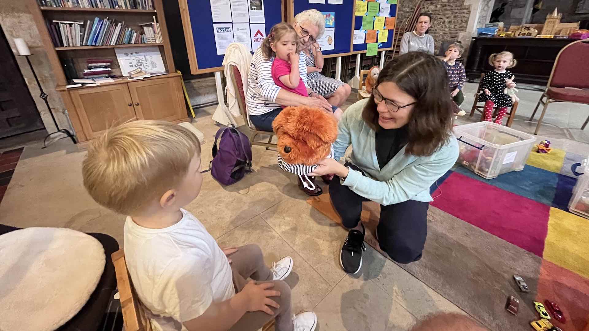
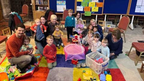
Tots’ Time
Toys, action songs, refreshments: a time to make friends and build relationships.
Ottery St Mary Parish Church
Monday (Term time)
2:00 PM - 3:00 PM
0-4
Rosie Hall on 07795 835000

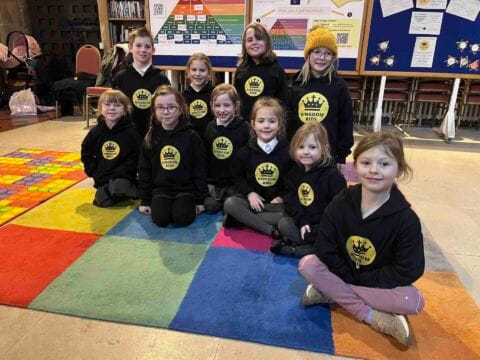
Kingdom kids
Kingdom Kids is for children aged 4+ to enjoy singing, craft, storytime and fun. There are separate activities for older children.
Ottery St Mary Parish Church
Thursday (Term time only)
4:00 PM - 5:00 PM
4+
Jane Bennett on 07951 862725

3 overlapping images
Fixed design of 3 overlapping images in a container. Centre image should be portrait orientation with left and right being landscape.

2 overlapping images
Fixed design of 2 overlapping images in a block.


Masonary image block
Fixed design masonary layout of images in a block. Additional images can be added in which case the css on the masonary group block ID should be modified accordingly. Aspect ratio and image width can also be changed.
The masonary group block is sticky so when placed in another block that is longer, the masonary block will move down the parent card layout when the page is scrolled.
